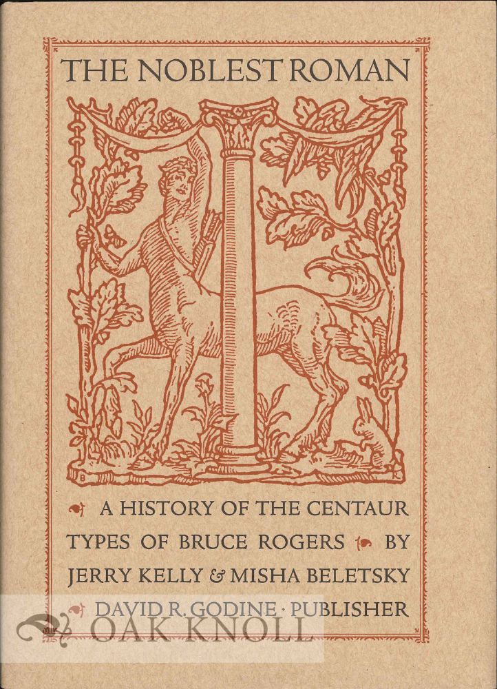
THE NOBLEST ROMAN: A HISTORY OF THE CENTAUR TYPES OF BRUCE ROGERS.
- Boston, MA: David R. Godine, 2016.
- small 4to.
- paper-covered boards, dust jacket
- 120, (2) pages
- ISBN: 9781939125248
Price: $45.00 other currencies
Order Nr. 129302
Roughly fifteen years after Gutenberg printed the first substantial book in Mainz in 1455, Nicolas Jenson of Venice produced what has been universally recognized among the most beautiful typefaces ever created. Based on the humanistic calligraphy of the Renaissance, an even and infinitely various set of lowercase letters that had evolved from the Carolingian minuscules of the ninth century, Jenson's types were a miracle of proportion and evenness of color. In the late nineteenth century, it was imitated by Morris in his Golden Type of 1892 (far too heavy), and in the next by Cobden-Sanderson with his Doves Type, Goudy with his Deepdene, and Hunter Middleton with his Eusebius.
But it was really not until Bruce Rogers, following his stint at the Riverside Press in Cambridge, Massachusetts, where he first attempted a version of the type in his Montaigne font, tackled the challenge of creating a roman equal to (and in some ways surpassing) the Jenson original. The proof of his success is that it has been used, and held in high esteem, ever since.
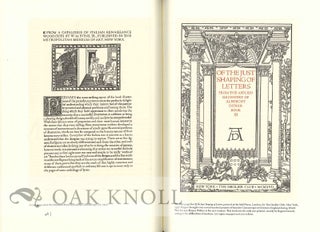
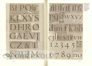
The story behind the type, the many permutations through which it went, the myths that accrued and surrounded it (many based on Rogers s somewhat erratic and chimerical memory) are all exposed in this fully documented account of the type's genesis and development. All the variations are included, from the 16-pt. roman originally produced for the exclusive use of the Metropolitan Museum of Art, to its conversion to the Monotype machine under the supervision of Stanley Morison, a typewriter version, a short-lived film version, and its ultimate appearance as a digital face. Included as well is a discussion of the Arrighi italic, developed to accompany the roman by Frederic Warde and Stanley Morison at the Monotype Corporation.
The book has been designed and set in a new digital version of Centaur, often and justly called "the noblest roman of them all," created by Jerry Kelly. The authors have unearthed, mined, and refined a trove of typographic material to create the definitive history of what many consider the most beautiful typeface created by an American in the last century and used, to immortal effect, in two of the century's greatest books, T.E. Lawrence's Odyssey of Homer and the Oxford Lectern Bible. Illustrated with many examples in full color, with a dust jacket printed letterpress, issued in an edition of only 1,000 copies, this is a book no certified member of the lunatic fringe of type fanatics can afford to ignore.
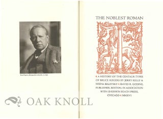
Table of contents, acknowledgments, foreword by Amelia Hugill-Fontanel, endnotes, index. Type specimens and bibliography of books in Original Foundry Centaur Type follow text. Frontispiece portrait of Bruce Rogers and illustrations throughout text.

